


Why the uplift?
It is crucial to evaluate your brand with every big step you take, in order to reflect the growth of the company. And after two years from the date of establishment, Caktuss has been taking huge steps. From landing big clients, to expanding their office, to hiring more people to work in harmony to reach the same goal, and more!
Thus, the logo needed some fine tuning to match the new and improved essence of the company.

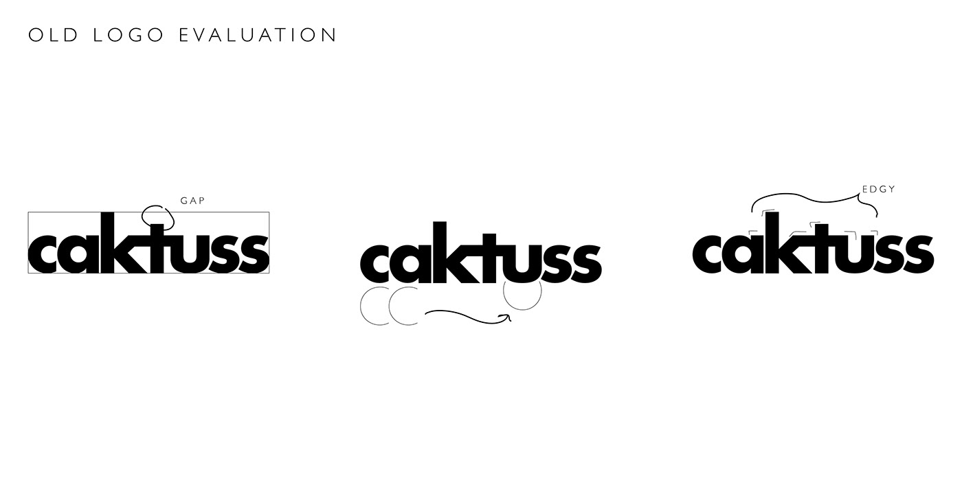
If we saw the old logo as one form, it was imbalanced in the center, the curves of the letters did not seem that they belong to the same family, and although the agency is called 'Caktuss', too much edgy points at the tip of the letters emphasises on the characteristic of thorns rather than the curved tips of the cactus.

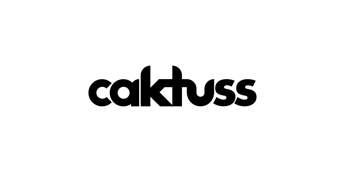

The benefit of the updated logo is that it is refined without losing the identity completely, it is still bold, solid, lowercased, and the same colour. This helps to ensure that the logo is still recognisable to loyal customers, while also appealing to a new audience of potential clients who are looking for a company that thrives for perfection.

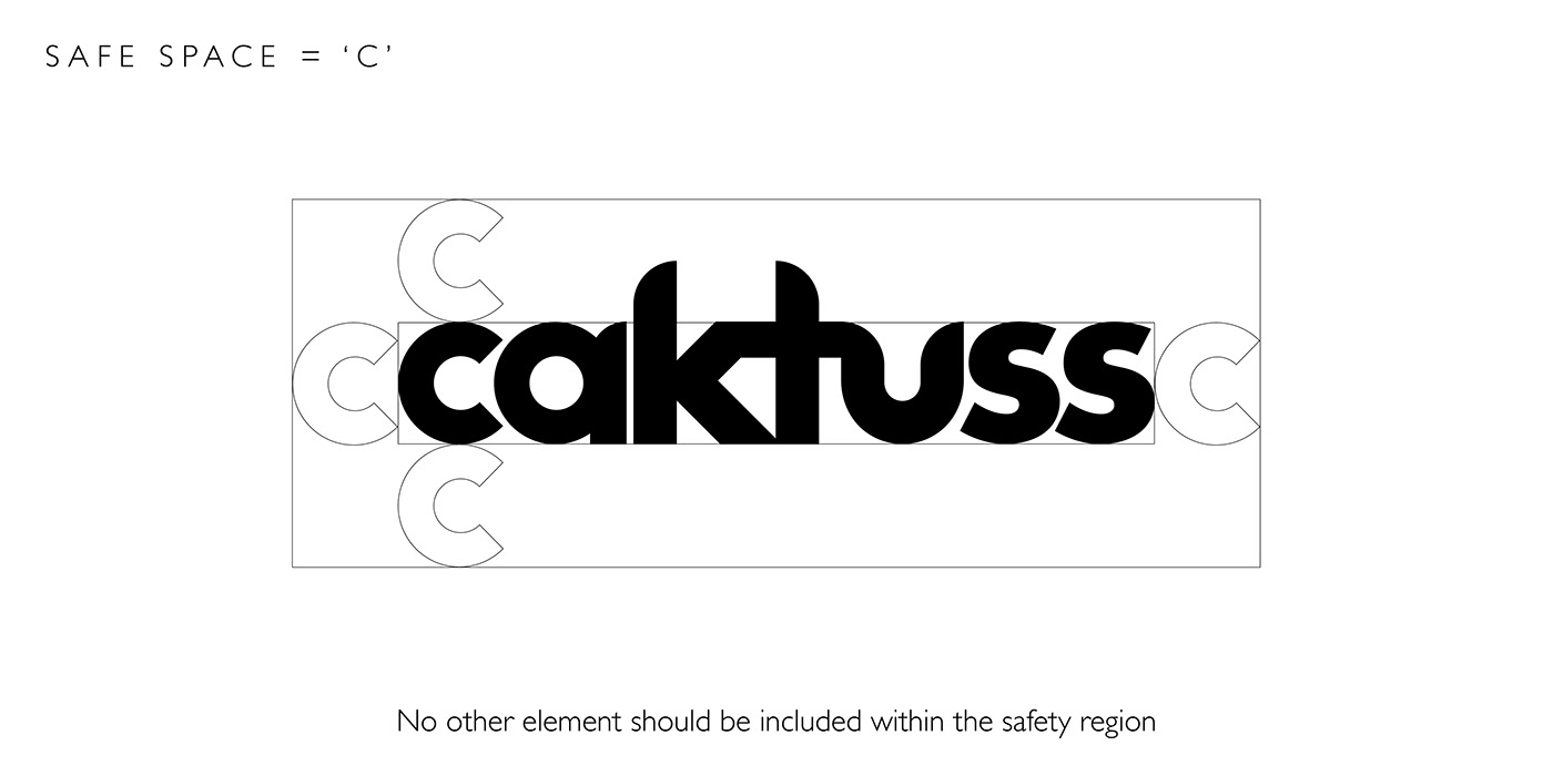
It is important that the logo is visible at any size, the bigger the clearer, but the issue arises when the logo gets smaller, by that its readability can be challenging. It is encouraged that on a mini scale to use the 'responsive' logo option. This flexibility of use will make the logo clear on anything, no matter how small.


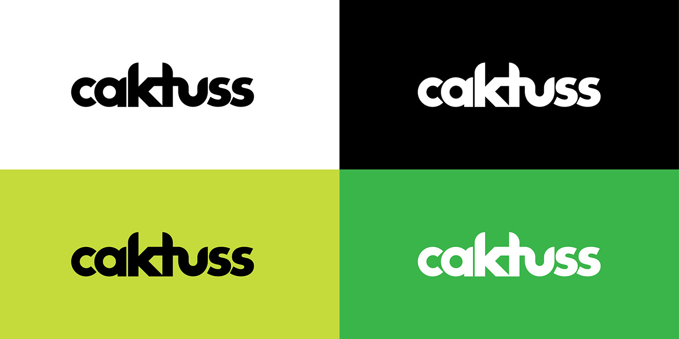
Colour psychology also plays a great role when designing a personality of a brand. The use of each colour is picked for a specific purpose:
White: Clarity and refinement.
White: Clarity and refinement.
Black: Professionalism and strength.
Lime Green: Creativity and freshness.
Green: Growth and positivity.


Adding elements to a brand can help to enhance its personality and make it more memorable. Therefore, the elements are bold, vibrant, fun, creative and unique, just like Caktuss.


Since the tweaks are minimal, they still make a great impact on the overall result. So a step-by-step animated post was necessary to inform the audience about the update in an amusing manner, with the addition of the brand visuals and colour to the post, to be able to fit all the pieces together.
Special thanks to Ahmed Samy for animating my vision to reality and adding great features to the post to make it pop out more and grab everyone's attention!
His unique skills made this post possible.
Click here to view their instagram page


